Schoox
Creating L&D tools that improve workplace learning with a people-first twist to build better teams and cultures.
Project Goals
Schoox had always been an innovative leader in the LMS market. However, years of feature updates and contractual changes had made the UI unwieldy. To reclaim their position as the market front-runner, they needed to build a strong team, establish efficient operations, and develop a method to validate the success of their design efforts.
Team Growth
Growth Over 3 Years
New Components
Project Strategy
Our first step was to establish a team and the design center so we had the needed infrastructure to build a design system, rethink the architecture of the product, and implement a customer research team to validate design decisions.
Design
UI Inventory Audit
Design Tokens
Component Library
Documentation
Product
Qualitative Data
Cross-team Ops
Info Architecture
Data-Driven Feedback
Design Ops
Talent Development
Team Operations
Project Scoping
Culture Development
“We are design soulmates and together we will build a product that will force our competitors to pack up and go home.”Lefteris Ntouanoglou
CEO, Schoox

Establishing the
Design Center
Building the Team
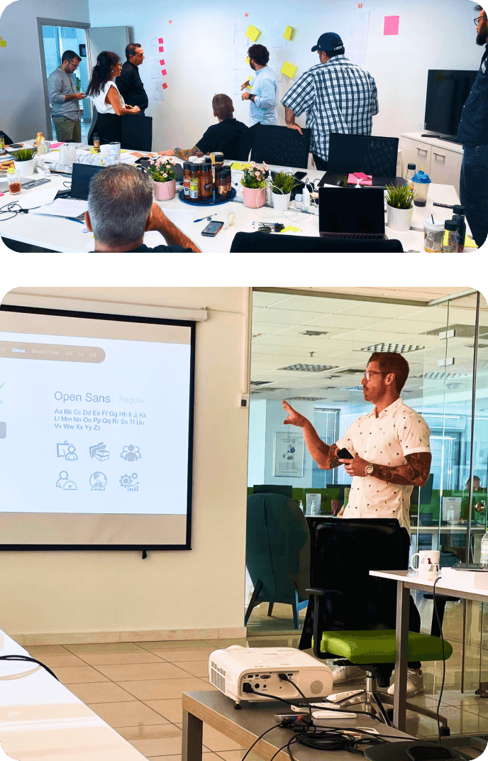
When I joined Schoox, the design team consisted of just three members: one focused on the web product, one on mobile, and one on marketing. Over time, we expanded the team to nineteen members and established a design center supporting multiple teams across the organization. This center included five key departments: design system, experience design, UX writing, UX research, and brand. We also developed operational processes to support development, product, customer success, sales, marketing, and people and culture initiatives.

Establishing Design Ops
With the team in place, we needed to establish design operations to ensure the team could stay focused on their work. This allowed me to protect their time and help them produce better work, faster. I also prioritized their professional growth through design workshops, increased responsibilities, and emotional support. We fostered collaboration through daily design team huddles and company-wide design updates. Additionally, I managed headcount planning, onboarding, project scoping, and culture and diversity initiatives.
To Bifurcate or Not
The first major decision was whether to split our development efforts. This bifurcation would necessitate forming a new development team and dividing the product team to support both new and legacy products. While this approach would enable radical innovation and allow us to build a cleaner, more efficient back-end, the significant drawbacks included high costs and an extended timeline, with years before we could onboard customers.
Ultimately, we chose to evolve the current product feature by feature. This strategy allowed us to engage existing customers in the design process and provided the sales team with a continuous deployment roadmap for new features and updates.
Building a Foundation;
The Design System
UI Audit
The UI audit was essential for creating the design system. We needed to identify and logically organize all UI components, similar to a content audit but focused on cataloging the product’s elements. After completing the audit, we could accurately scope the work, develop a detailed roadmap with timelines, and integrate it into the broader product roadmap. This ensured that the required components would be ready when designing new experiences.
Defining the Structure
When defining the structure of our design system, we organized it into four key areas:
Foundation
Built on design tokens, which are the variables in Figma that form the basis for all other elements and components.


Elements
Basic components like notification tags, input fields, buttons, and more, constructed from design tokens.
Components
Functional groups of tokens and elements that can have multiple variants, allowing for flexibility. Examples include cards, which can vary in size and content layout; input fields that may differ in style and validation rules; and tab groups that can change in appearance and behavior depending on the context. These components are essential for creating a cohesive user experience across the product.


Patterns
Reusable features across the product that foster mental modeling and create a more intuitive user experience. Examples include meta filters, global search, and content streams. Patterns are categorized into two groups: those delivered to development and those intended for the design team only, as determined at the product level by the supported teams.
This structured approach ensures consistency, reusability, and a seamless user experience across the product.
Design Tokens
Design tokens form the foundation of our design system, serving as the injection point for styling in the code. A well-constructed token system gave us full control over the theming of customers’ UIs, managing everything from colors and spacing to fonts and border-radius. This control allowed our product to deeply integrate with customers’ brands, ensuring a seamless employee experience. This capability was unprecedented for Schoox and significantly enhanced our offering.


 This is only an example that illustrates the power of layered design tokens
 Maintenance & Versioning
As the design system matured, we focused on maintaining it effectively through versioning, governance, and QA.

Versioning
We opted to version individual components rather than the entire library, allowing us to create new components and variants in real-time as we developed new experiences.
Governance
We established a governance model to ensure thoughtful scaling, meeting product needs while avoiding bloat and duplication.
Component QA
Design QA became a crucial final step in our process. As components were built, they were added to Storybook for the team to test animations, props, states, and tokens.
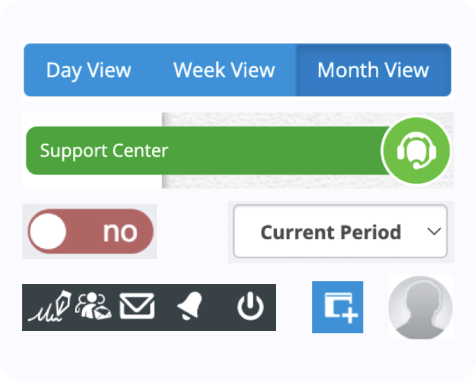
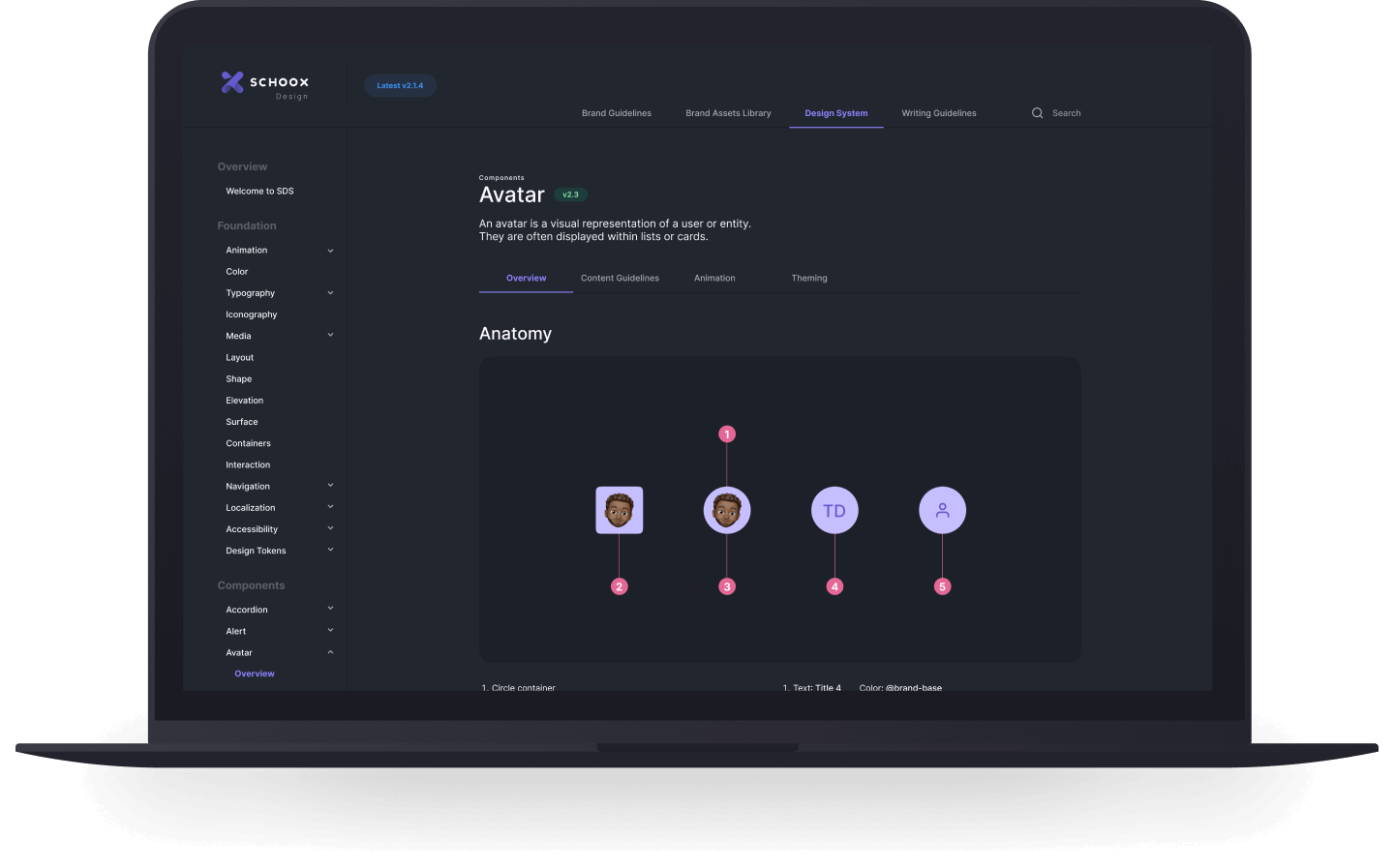
Design Portal
To ensure that assets and documentation were readily available throughout the company, we created a design portal. This portal offered comprehensive resources, including documentation for design tokens, component usage, and accessibility guidelines, as well as writing guidelines, downloadable assets, and tutorials. It also housed brand guidelines, brand assets, and support contact information. This centralized approach streamlined access to critical design resources, facilitating better collaboration and consistency.
company access to assets, documentation, and points of contact.
Building Trust
A design system is a foundational framework shared across multiple departments, making clear roles and responsibilities. We aimed to integrate every department’s tools, from Figma to Storybook to Jira and more. We collaborated closely with supported teams involving them in the creation process. By identifying leads across departments to contribute to resource development, we ensured a deeper understanding of how to use and implement the design system across the product.


UXR Guild
Building Partnerships
Customer input was critical to the success of our product update. While setting up our tooling with platforms like UserTesting, Maze, UsabilityHub, Hotjar, UX Cam, and Dovetail, we collaborated with other teams for additional support. The Customer Success team provided access to GainSight PX for quantitative insights, while the Marketing team leveraged Google Analytics, Crayon, and Gartner for market research and competitive analysis.
The Guild's Process
Integrating research into the design process was a new initiative at Schoox. We started by using the HEART framework to gather qualitative data, assess feature performance, and set KPIs for redesign success.
With KPIs established, we conducted qualitative research and gathered market data through the Marketing team. The research team then provided actionable insights for design and product development. Initial designs were tested with customers in usability studies.
Once we were confident in the designs, they moved through development, QA, and production. Post-launch, we performed quantitative HEART assessments at 30, 60, and 90 days to evaluate success. If KPIs weren’t met, the feature was reintroduced into the roadmap for further iteration.


Transforming the Product Experience
Named Versioning
Redesigning a fourteen-year-old product with hundreds of thousands of active users is a complex and delicate task. While Schoox's continuous deployment strategy has been effective for quickly rolling out new features, it has also made it difficult to maintain a consistent and cohesive user experience.
To address this, we introduced semantic versioning with a branded name for each major release. This approach allowed us to craft a clear marketing strategy, improve customer support, and provide users with a more unified and polished experience.

Phased Rollout
To evolve the product effectively, we implemented a phased rollout with a clear communication and education strategy. We started by updating the learner experience, focusing on course interactions and career pathing. Next, we enhanced the manager experience, including training assignments and reporting. Finally, we improved the admin experience, addressing academy settings, course creation, and business impact.
After deploying these updates and training customers on the new experience, Sigma, we collected UX data at scale to guide further refinements. This iterative approach led to the release of our next version, Tau. Through semantic versioning and efficient design operations, we continually refined and delivered an optimized experience for our customers.


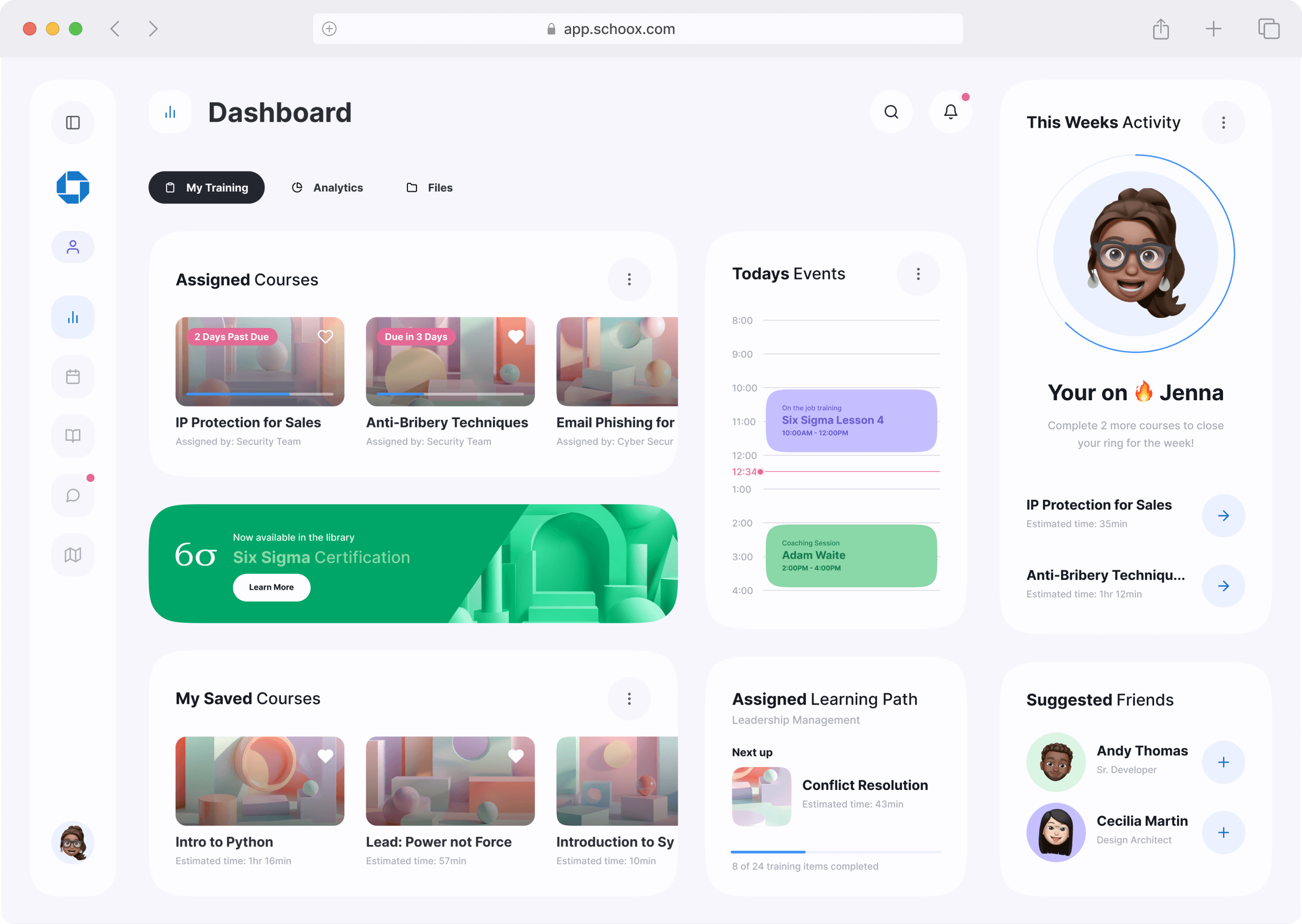
Responsive Web
Schoox had never implemented a responsive web product, leading to two main issues: users with smaller monitors faced horizontal scrolling, while those with larger monitors dealt with a narrow interface. We addressed this by implementing flexible CSS grids and strategic breakpoints, optimizing the layout for both large and small screens to make the best use of available space.


Consistency Between
Web & Mobile
Another challenge was the lack of consistency between Schoox’s web and mobile experiences. By unifying these platforms, we ensured that customers could learn the product once and seamlessly navigate it on any device. This approach enhanced usability, making the product more intuitive and engaging, and significantly improving overall customer satisfaction.


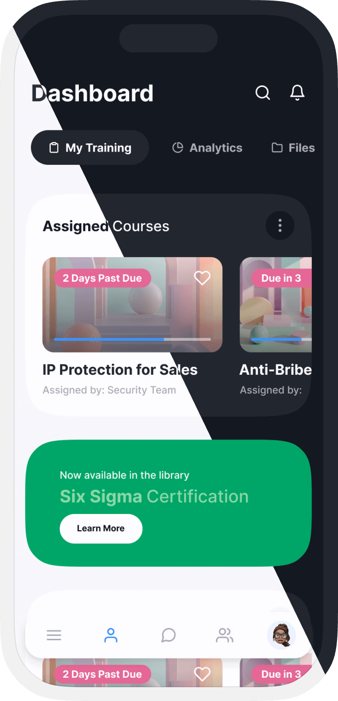
Light & Dark Themes
Schoox introduced both light and dark themes to enhance user experience. The dark theme reduces eye strain and improves readability in low-light conditions, while the light theme suits daytime use. Offering both options caters to diverse user preferences, making the interface more adaptable and personalized.

Workspaces
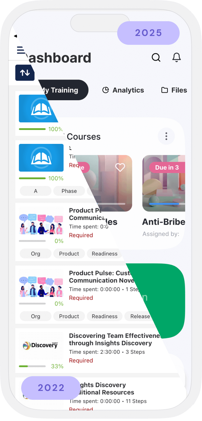
With our versioning and rollout strategy set, we tackled the redesign, starting with rethinking the information architecture and site map. Given our extensive feature set, we created tailored workspaces for different user types—learners, managers, and administrators. This approach streamlined the platform, making it easier to navigate and highlighting previously hidden features. The result was improved usability and increased user engagement.

Paving the Way for Innovation
In just three years, we achieved major transformations that repositioned the product. By focusing on feature-by-feature improvements, we set the stage for delivering exceptional experiences and continuous innovation for our customers.

Branding
Outbound Communication
To complement the design team’s outstanding work, we established a plan for outbound communication. We launched a monthly Demo Day meeting, followed by a company-wide email detailing new features, updates, and the reasoning behind them. This approach built excitement, kept the organization informed, and ensured all departments were aware of upcoming changes, which was especially important in a fully remote environment.
Rebranding the Company
As we launched new product experiences and features, we aimed to reintroduce our brand to the public, emphasizing our evolution. Collaborating with leadership and marketing, we defined a brand personality that set us apart from competitors. This involved rethinking our brand mark, typeface, and color palette, and introducing a unique photography and illustration style. We also made the bold choice to default our product to a dark theme, a first in our industry.
Logo Update
Primary Brand
Colors
We selected blue and purple as the core colors for the Schoox brand. Blue conveys boldness, modernity, and trust, while purple adds a youthful, spirited touch and a sense of royalty. This combination creates a vibrant, impactful palette that resonates with a wide audience, fostering a creative and dynamic brand environment.


Secondary Brand
Colors
Red and green enhance our brand palette by creating vibrant and balanced contrast. Red, symbolizing energy, passion, and urgency, captures attention and drives action. Green represents growth, harmony, and stability, evoking a sense of nature and well-being. Together, these colors create a dynamic palette that blends intensity with calm, making the brand both engaging and trustworthy.


Typography
For Schoox, we chose Inter, a modern font designed for user interfaces. Its clean design ensures readability across various sizes, crucial for both web and mobile applications. The diverse range of weights allows for clear, structured hierarchies within the UI.


Illustrations
To stand out from competitors and infuse personality into the brand, we focused on photography. Collaborating with photographer Patrick Michael Chin, we captured students in their natural environment, showcasing authenticity and enhancing our marketing content. This approach significantly impacted our visual storytelling and brand representation.


Key Takeaways

Biggest Challenges
Gaining Research Buy-In
Securing leadership’s support for customer insights was difficult. Through collaboration with various teams, we gradually built trust and emphasized the importance of research.
Modernizing Operations
Integrating design operations with other teams required significant adaptation. Despite initial resistance, this effort led to notable improvements in efficiency and partnerships.
Implementing Data-Driven Design
Emphasizing KPIs and research to guide design proved challenging. However, we progressively gained support and influenced the company's product development approach.
Updating Back-End Architecture
We recommended aligning the back-end with the front-end to enhance performance. Ultimately, leadership decided the cost and effort did not justify the benefits.

Biggest Wins
Establishing the Design Center
The design center enhanced the credibility of design within Schoox, providing a unified visual identity and clear guidelines across teams.
Building a World-Class Team
Growing a diverse and talented team brought a range of perspectives, enriching the design process and enhancing the overall product experience.
Creating the Design System
Implementing a design system and updating the UI framework resulted in a scalable, maintainable interface, promoting collaboration among design, mobile, and front-end teams.
Revamping the Brand
We redefined Schoox's brand identity, creating a robust foundation for the brand mark, visual identity, and tone of voice.
Let’s chat
If you have any questions regarding design leadership, operations, building and scaling design systems, or fostering a culture of creativity and innovation, please don’t hesitate to reach out. I’d be happy to schedule a time for us to connect and discuss further.
Contact